Redesigning User Onboarding journey
New user onboarding to optimise the account upgrade experience and introduce a new identity verification to enhance platform trust and confidence.
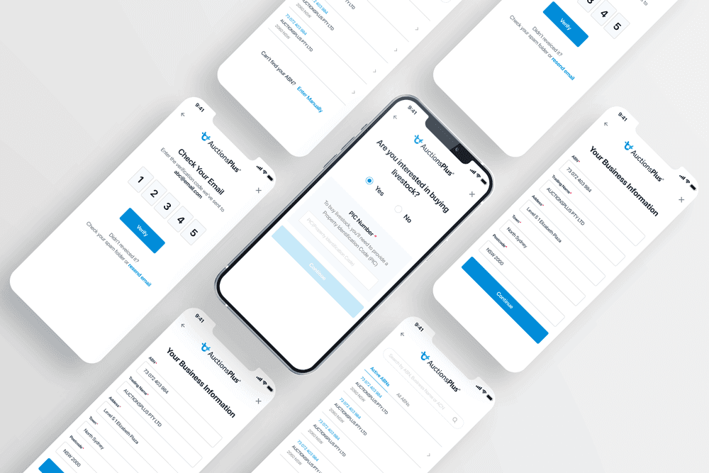
Company
AuctionsPlus
Role
UX/UI Designer
Front-end Developer
Task
User Research, Wireframe, Interaction, Visual Design, Prototype, Testing,
Front-end development (Vue.js)
Year
2021-2022
Project Overview
To comply with my non-disclosure agreement, I have omitted confidential information in this case study. All information is my own and does not necessarily reflect the views of AuctionsPlus.
AuctionsPlus is the largest agricultural digital trading platform that offers the greatest access to information and choice to the Australian Agricultural Industry.
Many users quit platforms during upgrading processes due to a disjointed upgrading workflow on the sign-up page. This onboarding journey problem affected not just the users but also the business as operations teams must do the significant heavy lifting to manually help onboard users. This can take up 50% of Market Ops time.
To optimise the user’s account upgrade experience and facilitate a better relationship between the business and the customer, we redesigned the onboarding journey. This included a new identity verification interface to improve platform trust and the KYC process.
In addition, we aimed to reduce operational workload through increased automation of the user onboarding process.
My Role
I led this project’s product design (UX/UI) and front-end development. My primary responsibilities included managing the entire product development process from identifying user inefficiencies to delivering an upgraded system, including communicating with key stakeholders across the business on product strategy and prioritisation, creating low and hi-fi prototypes for testing and experimentation, and developing user interface and front-end functionalities.
Discovery
Task Analysis and Heuristic Evaluation
To identify the existing onboarding workflow and how users complete tasks to achieve their goals during the onboarding process, I began by examining the platform’s screen flow and the interactions that users had with the screen and, in particular, the onboarding process.
I then conducted the heuristic evaluation of the existing user interface based on Nielsen’s 10 Heuristic Principles to find usability flaws and classified the usability issues with the severity rating scale.
I used the following 0 to 4 scale to rate the severity of usability problems:
0 = I don’t agree that this is a usability problem at all
1 = Cosmetic problem only: need not be fixed unless extra time is available on project
2 = Minor usability problem: fixing this should be given low priority
3 = Major usability problem: important to fix, so should be given high priority
4 = Usability catastrophe: imperative to fix this before product can be released

Drop-off and User Pain Points Analysis
After I classified the usability issues, I gathered the onboarding data from Google Analytics and engineering team to investigate the user drop-off rates and analyse user behaviour during the registration process. Moreover, I gathered user feedback from the support channel and project backlogs to identify pain points and user needs.


Key Usability Issues
Issue 1 - Email confirmation required page

We found that user drop-offs peaked after the email confirmation step in the registration process because users could not access their registered email accounts. For example, some users may have entered the wrong email address during the sign-up process without realising. In this previously existing registration process, the sign-up page did not display the email address used for registration, so users had no way to confirm they entered the correct email address. They also had no reminder of which email address they used. As a result, they could not verify their email when prompted.
Issue 2 - Disjointed upgrading process
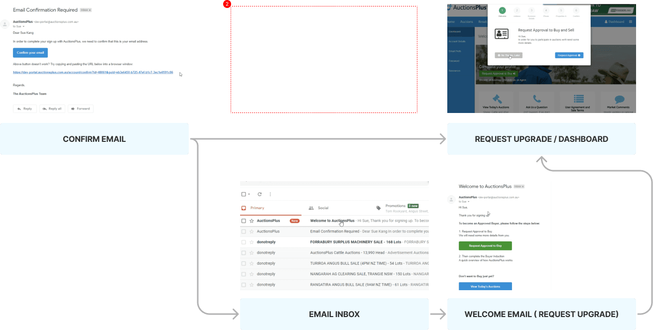
The most significant pain point in the account upgrading process was the disjointed path between the sign-up and the upgrading process, as the registration flow ended at the email confirmation request page.
In the previous flow, there were three paths to upgrade the account:
1. Through the email confirmation link
2. Through the dashboard
3. Through the upgrade link in the welcome email.
We found users were often confused by the upgrade process as there was no seamless start-to-finish process available. As a result, they often prematurely stopped upgrading their account.
Issue 3 - Inconsistent upgrading steps

Inconsistent step information confused users by showing three different sets of steps during onboarding.
Ideation
Email Verification
To reduce the email verification drop-off rates, I have considered two email verification methods: the verification link and code.

A verification code reaches more users than a verification link, which can be blocked by spam filters and can lead to potential security breaches.
However, some UX articles argue that sending a confirmation link is a more user-friendly approach than a verification code; it requires the least effort on the user’s part. All the user has to do is click on the link and confirm their email address.
Even though we acknowledge that the verification code method needs more effort from end users, we have decided to change the email verification method to a verification code in order to reduce any disconnection for users to follow the next step. Thus, users can stay in the same browser and finish the email confirmation during the registration process.
Competitive Analysis
In order to understand competitive landscape and strategic insights of competitors’ products, I conducted the competitive analysis.
Impact
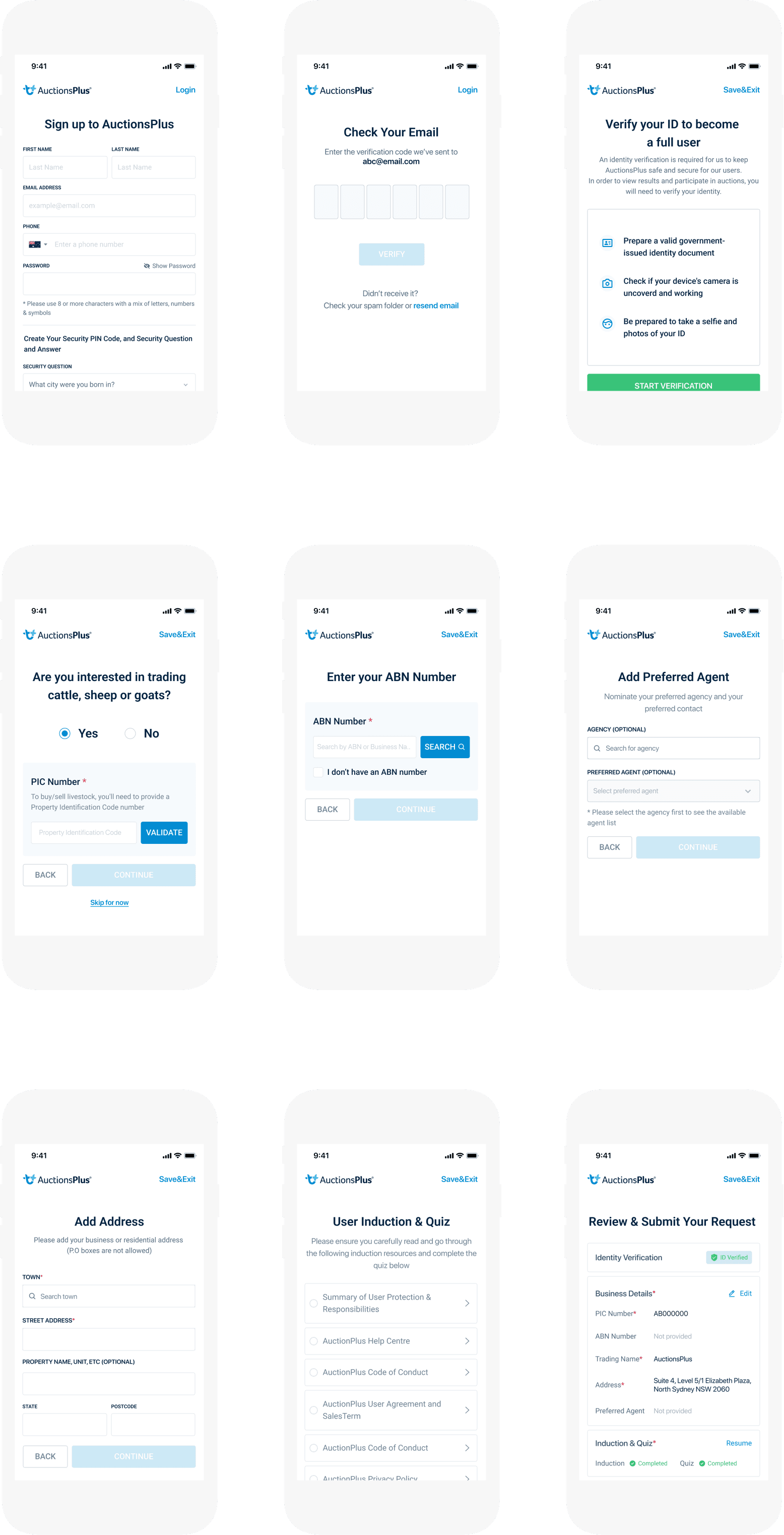
The redesigned onboarding and account-upgrade flow reduced email-verification and upgrade-path drop-off, giving firms a single seamless path from sign-up to full account access. It also introduced Onfido for identity verification, bringing formal KYC compliance to the platform for the first time — designed and built end-to-end, including the front-end in Vue.js.