Live Auction Bidding Platform Redesign
Redesigning the number one live auction bidding platform for the Australian Agricultural Industry.

Company
AuctionsPlus
Task
User Research, Wireframe, Interaction, Visual Design, Prototype, Testing
Impact
3,000+ auctions/year
Year
2020-2021
Project Overview
To comply with my non-disclosure agreement, I have omitted confidential information in this case study. All information is my own and does not necessarily reflect the views of AuctionsPlus.
AuctionsPlus is the largest agricultural digital trading platform that offers the greatest access to information and choice to the Australian Agricultural Industry.
The motivation behind redesigning the live auction platform was scalability. The application framework used for the previous platform was outdated. Further, the application framework was scheduled to be discontinued. Thus, AuctionsPlus decided to rewrite and rebuild the whole auction platform.
The Goals
Re-develop the existing online auction bidding platform with the latest technologies to accelerate a real-time system that could handle much more load on its streamline.
Deliver an intuitive and seamless transition experience for end users.
My Role
I led the Product Design (UX, UI) on this project. Our team consisted of 9 internal/external engineers and one project manager. My primary responsibilities included analysing existing interactions on the previous auction bidding platform, defining user frustrations and functional requirements, wireframing low fidelity designs to prototyping high fidelity designs and collaborating with the stakeholders and developers to manage the entire design lifecycle and to bring out the product live.
Discovery
Interface Analysis
I began by creating and analysing the existing bidding platform’s information architecture to understand the system’s current workflow and user interaction. During the IA analysis, I also evaluated the usability of the existing user interface through cognitive walkthrough and heuristic evaluation methods. The purpose of this evaluation was to identify usability problems in the design and ideate possible solutions.

Analysing the Insights
After analysing and evaluating the interface, I gathered user feedback from the support channel and user survey and documented it in sticky notes to organise the feedback. I then conducted affinity mapping with the collective notes, grouping the feedback into different user groups, timelines, common themes and features to synthesise fundamental users’ pain points and functional requirements.

Key Pain Points
“Hard to browse other lots on the bidding platform, so I need I muck it up most times to go back to the website to view catalogue”
A key user pain point from the design sprint is that users have difficulty browsing listings within the bidding platform. Users needed a different browser for browsing and, as a result, constantly switched browsers to view the catalogue and bidding platform unless they had multiple screens.

Pain point 1
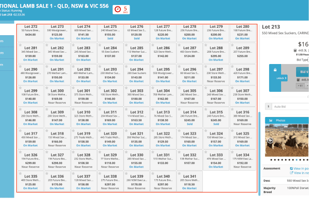
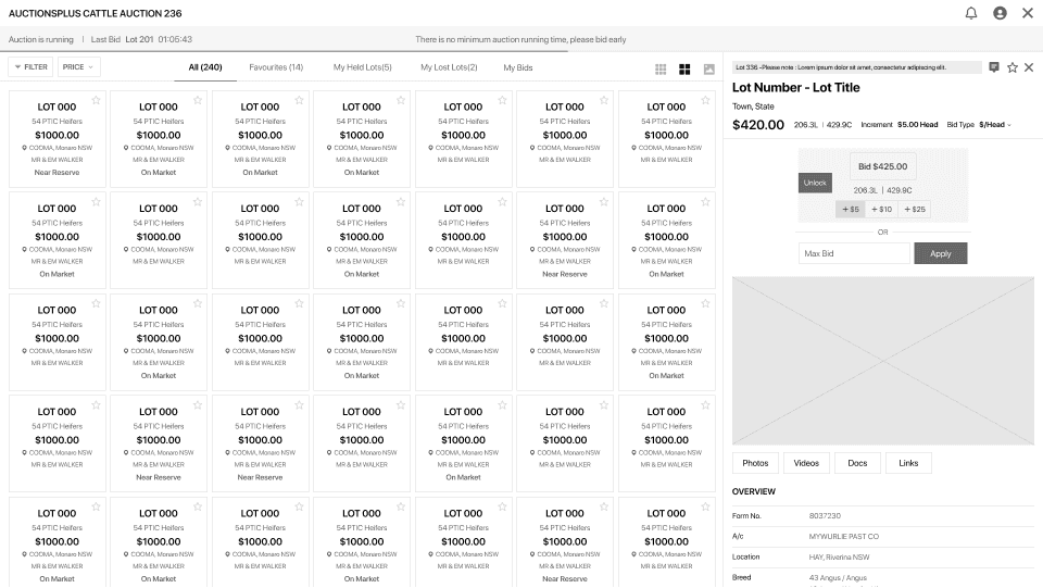
Listing information on the lot tile was limited, making it difficult to browse listings in the bidding platform.
Pain point 2
Identifying a lot was quite challenging in a big simultaneous auction unless listings had been favourited in a favourite list.
Pain point 3
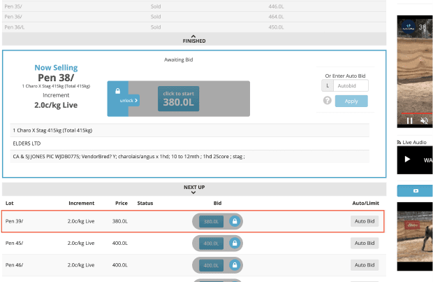
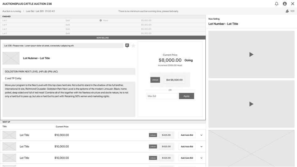
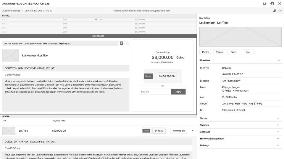
There was no listing details for upcoming sales in the sequential auctions, so users needed to switch browsers to see the upcoming sales listing information.

Pain point 4
It was difficult to match the information in the right panel with a now-selling listing at a glance, as there was no indication on the panel that information was for a now-selling listing.
Other Quotes from Users

I’d like to control the sounds I hear during an auction. Mostly to differentiate when outbid in a lot - have different sound, or at least ability to turn off the sound for all bids.
I’d like to see number of bidders logged in, and number of bids places and any other sort of engagement metrics.
I’d like a way to better compare prices of similar stock while bidding in auction.
Ideation
Solutions
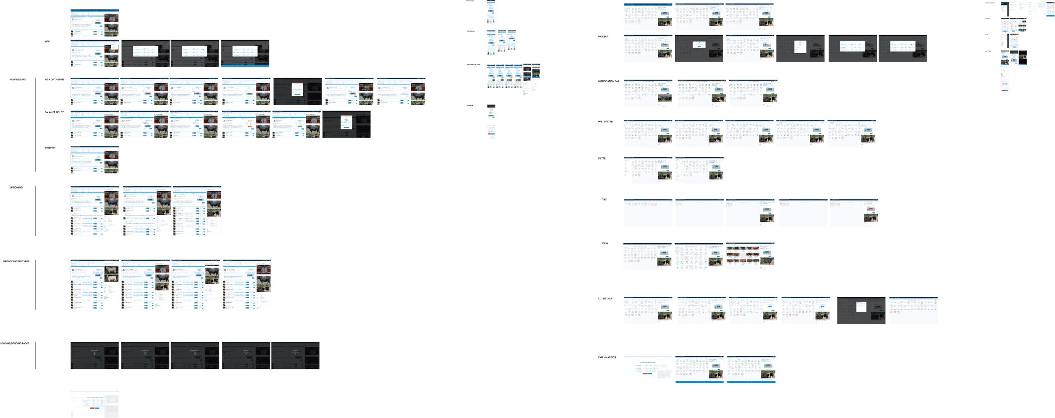
Based on the problems identified above, I developed potential solutions and created a low-fi wireframe.

View Options
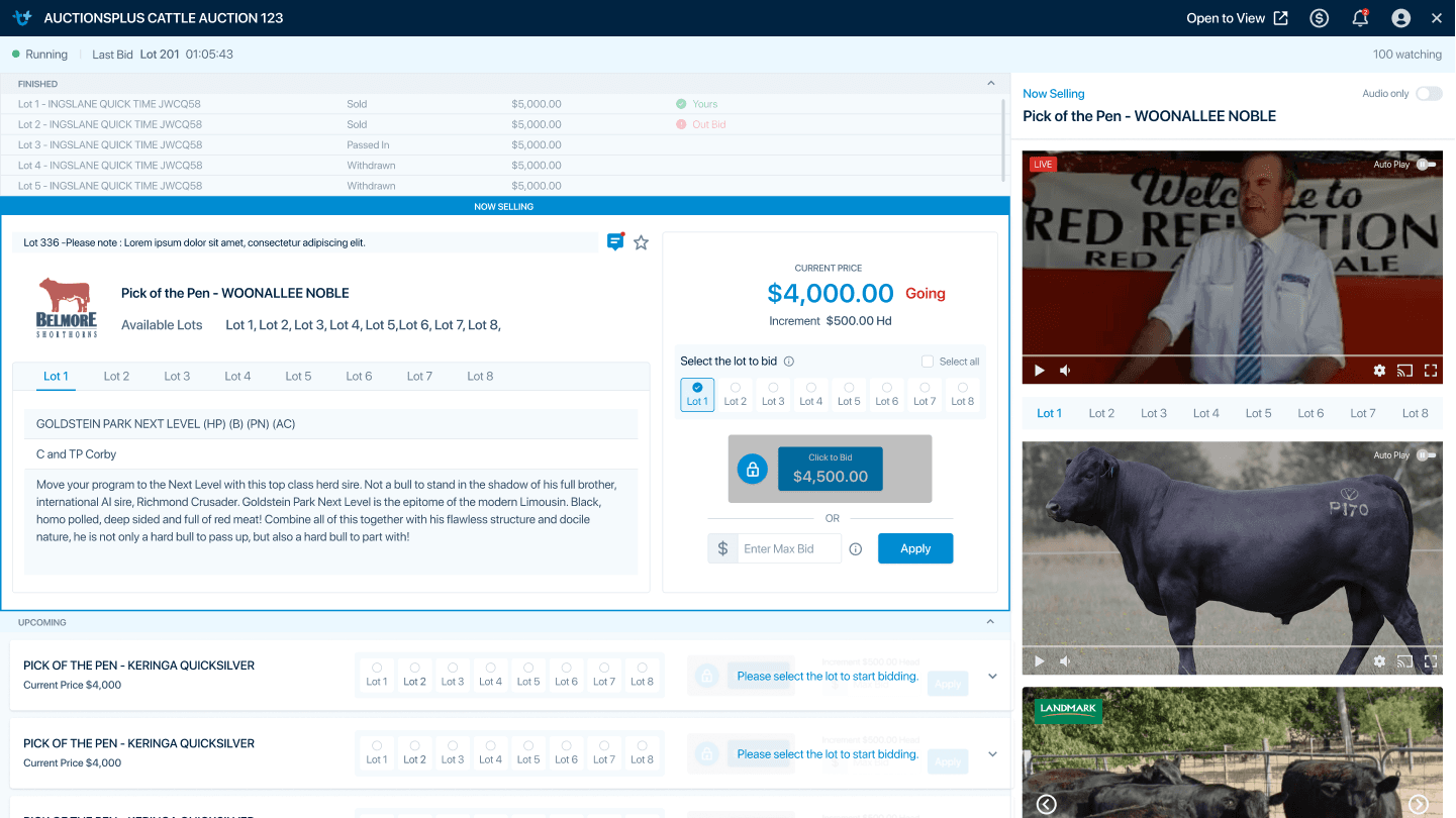
Provide three view options that include additional information depending on card sizes, such as locations, vendors, and photos to help users browse and quickly identify lots in the bidding platform.

Filter
Offer a filtering function to enhance the browsing experience in the big simultaneous auction by refining items by price range, category, locations, and more.

Accordion
Provide item information on the upcoming selling items in a sequential auction, using an accordion that can hide and reveal associated information. This will enable users to see more details and keep track of the order of upcoming sales.

Status Indicator
Provide clear indicators on the now-selling item panel so that users can immediately obtain currently selling items information.

Sound Preferences
Enable users to control the bid sound, providing sound preferences menu under their account.

Engagement Metric
Provide a metric that shows the number of online viewers tuned into a live stream in real time.



Usability Study
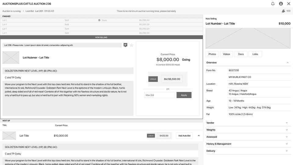
I conducted testing to discover opportunities to improve the design, user performance and user satisfaction. The following feedback was received during the testing.

Price Indicator
Some testers wanted to see the current price on the top of the lot details panel when they read the lot details.

Engagement Metric
Some testers noted the engagement metrics icon was unclear, making it hard to recognise intuitively.

Notification
The notification dot did not give the total number of notifications received. Thus, users could not notice the new notification after the first message.

Sound Preferences
Some testers wanted additional sound preferences settings; others wanted an option to mute the sound.
Visual Design
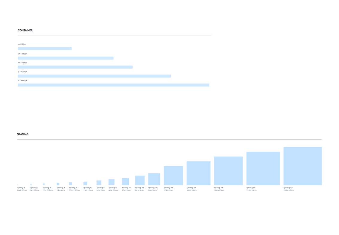
In order to create a cohesive product design and user experience, I applied the style of the current AuctionsPlus website and built the design system following the Atomic Design process.




Mockups (Before - After)
Here are some mockups showing changes between the existing and new auction platforms for mobile and desktop interfaces.